By
By 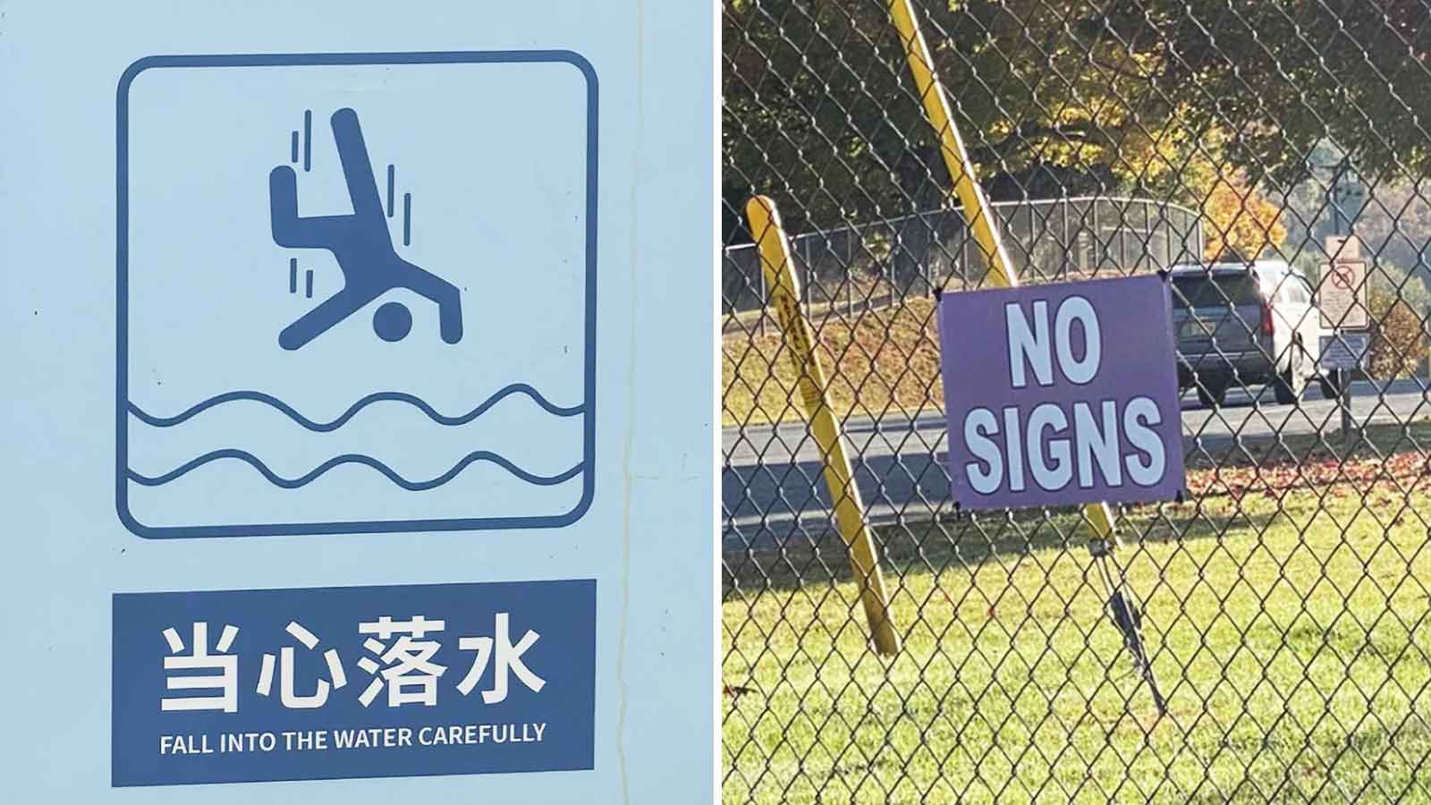
You probably don’t notice most signs during the day. They’re designed to give directions, share important information, or help people avoid making mistakes. But every now and then, someone gets the wording spectacularly wrong, and the sign becomes far more memorable than the message it was supposed to deliver. Sometimes it’s a typo. Other times it’s an unfortunate translation, confusing phrasing, or two instructions that completely contradict each other. Whatever the reason, these signs ended up making people laugh instead of helping them.
Here are the signs that clearly weren’t designed by anyone literate.
The World’s Least Convincing Lost Dog Poster
Instead of encouraging people to return the missing dog, this poster practically talks them out of it. Listing all of the dog’s worst qualities makes it one of the funniest lost pet notices imaginable.
The “STOB” Sign
One missing letter completely changes the message. It still looks enough like a stop sign to get the point across, but the typo is impossible to ignore.
The Surprisingly Polite Water Warning
Warning signs are supposed to help people avoid accidents. This one accidentally sounds like it’s encouraging visitors to fall into the water, just as long as they do it carefully.
The Honest Restaurant Sign
Most business signs try to attract customers with positive messages. This one takes the opposite approach by admitting it’s having a hard time keeping things under control.
The Restaurant That Wants to Cater Your Next Affair
The sign was almost certainly meant to advertise your next event. Unfortunately, one unfortunate word choice makes it sound like they’re promoting something very different.
The Bacon Seeds Problem
Instead of encouraging gardening, this sign points out one major obstacle to growing bacon. It’s a joke, but it’s hard not to smile after reading it.
The Door That Can’t Make Up Its Mind
The handle says “Pull,” while another label says, “Please do not pull.” Anyone approaching this door is left wondering which instruction they’re actually supposed to follow.
The Toilet Paper Notice That Needed Proofreading
The message asks people to stop stealing toilet paper, but several handwritten corrections steal the spotlight instead. The proofreading ended up becoming more memorable than the sign itself.
The Underwater Reminder
Technically, the advice is correct. Still, most people probably didn’t need a sign to remind them not to breathe underwater.
The Elevator Instructions
The safety notice tells people not to use the elevator during a fire, while the sign above labels it as the “Fire Lift.” It’s easy to see why someone might need a second to process the mixed messages.
The “No Signs” Sign
A sign announcing “No Signs” creates an amusing contradiction all by itself. Whether it’s intentional or not, it ends up defeating its own message.
The Zoo’s Creative Punishment
Instead of a standard warning, this zoo sign threatens rule-breakers with an extremely unusual consequence. The dramatic wording steals the spotlight from the actual instruction.
The Restaurant Name That Raises Eyebrows
The business was clearly aiming for a memorable name, but the spacing between the words creates an unfortunate first impression. Many people will probably read it twice before realizing what it actually says.
The “Private” Sign Everyone Read
Telling people not to read a sign is usually the quickest way to make sure they do exactly that. This one proves the point perfectly.
The Tire Shop’s Unfortunate Slogan
The message was meant to encourage drivers to replace worn tires before they fail. Unfortunately, the wording can easily be interpreted in a completely different way.
The post 15 Signs That Clearly Weren’t Designed By Anyone Literate appeared first on Den of Geek.