As expansive and varied as the genre has become over the years, Mario is still widely regarded as the king of side-scrollers, with classic titles like Super Mario Bros. 3, Super Mario World, New Super Mario Bros U, and even the recently released Super Mario Bros Wonder vying for the title of GOAT.
In my mind, the GOAT is a dinosaur. In the 2D side-scrolling realm, no game is more immaculate than Super Mario World 2: Yoshi’s Island. The perfect game may not exist, but this thing comes pretty damn close. It’s great at everything: The gameplay is tight, the levels are brilliantly designed, the soundtrack is brimming with bops, and the visuals are as stunning as anything else you’ll find on the SNES. Above all else, in the simplest terms, this game is still endlessly fun almost thirty years after its initial release.
Yoshi’s Island’s Style Is Part of Its Substance
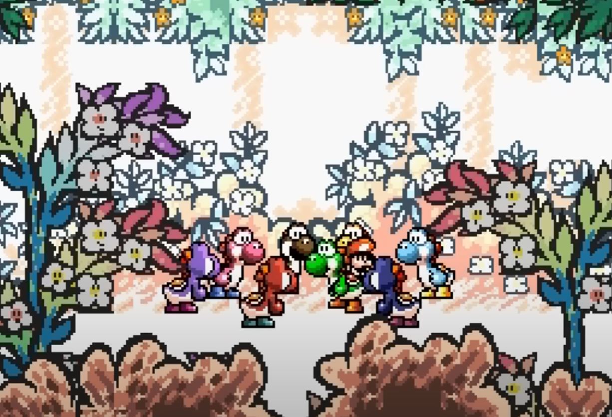
It’s commonplace in modern gaming for a game’s visuals to be hyper-stylized. Titles like Little Big Planet, the LEGO games, Paper Mario, Cuphead, Hi-Fi Rush, and countless others use real-world materials and mediums as points of recognition to lend the visuals a sense of tactility and texture. It’s an inspired artistic approach, and Yoshi’s Island was one of the very first games to fully commit to a high-concept art style adding to the experience in a meaningful way.
Yoshi’s Island’s visuals are, in a word, ravishing. The game is commonly described as looking like a coloring book come to life, but I think there’s a lot more to the game’s presentation than that. There is an overall scribbly-crayon aesthetic to the graphics, but when you look at the game in motion, it’s flashy, with cutting-edge effects that complement and contrast with the handmade visual elements.
And by handmade, I mean literally handmade! The developers at Nintendo EAD had artists draw many of the game’s assets, took scans of the illustrations, and then digitized the art pixel by pixel to adapt them to the SNES hardware. While one might assume this technique would result in a flat image considering the two-dimensional nature of drawings, the game’s visuals boast a ton of depth. Thoughtful touches like the foreground elements having thick, black-crayon borders and the far background elements having a more faded, watercolor look create the illusion of vastness. This depth affects gameplay too. When a chain chomp seemingly miles away in the background leaps into the foreground, it’s a startlingly convincing effect.
Look at any Yoshi’s Island screenshot and notice how moody and evocative the color palette is. The ombre sunset and deep blue river water in Level 3-3: Nep-Enut’s Domain. The glowing yellow, oranges, and reds pierce the dark, cool tones of Level 6-5: The Very Loooooong Cave (yes, that’s the actual spelling…god I love this game). The color work is astonishing. We tend to take things like this for granted these days, but in 1995, nuances like this made a huge difference. Many of those nuances can be attributed to the game’s sometimes forgotten technical innovations.
Yoshi’s Island Was An Overlooked Part of the Evolution of Video Game Graphics
Yoshi’s Island’s use of the Super FX2 chip was a big deal at the time of its release but has been largely forgotten about these days. An iteration on the Super FX chip originally employed by Argonaut Games’ Star Fox, variations of the chip were subsequently built into game cartridges to enhance graphics in ways the base SNES hardware could not. This allowed developers to display 3D, polygonal models.
What’s special about the way Yoshi’s Island utilizes the capabilities of the SNES and Super FX2 is that it does so tastefully. The game is far from a polygon fest like Starfox, but it does feature polygonal elements like falling walls and rolling barrels that don’t clash with the game’s overall aesthetic but rather accentuate it. They lend the game a subtle sense of physics and depth.
The game also uses other SNES tricks like Mode 7 feature to stretch and contort sprites and background and foreground elements. The effect was used most notably in Level 1-7 (Touch Fuzzy, Get Dizzy), in which the stage’s foreground and background start undulating psychedelically when Yoshi touches or eats one of the floating fuzzballs wafting through the level. The effect was mind-blowing, but it wasn’t just cosmetic. The stage is more difficult to traverse, making it even more difficult to avoid the fuzzies. It’s a creative way to add a layer of challenge to gameplay, and the concept of reality-altering enemies and items would later be expanded decades later in games like Super Mario Bros Wonder.
That said, my least favorite thing about Yoshi’s Island is that some of the cutscenes abandon the core aesthetic of the game and use pre-rendered models that, frankly, look like shit. It’s like that last scene in Psycho where the psychiatrist explains what’s going on in Norman Bates’ head. If that scene wasn’t in there, the film would be flawless.
Mind you, Yoshi’s Island was released in 1995. The Super Nintendo was far from an underpowered console, but the N64 was on the horizon, and computer-generated, pre-rendered graphics were hype as hell. Donkey Kong Country was doing big business, and there was pressure for new games to employ similar pre-rendering techniques to create a buzz. Yoshi’s Island should look like a relic given the technical revolutions on the horizon.
Yet, In 2024, Yoshi’s Island mostly looks marvelous, even by today’s standards. The game’s directors had a clear vision and committed to it. The playful, storybook theme is felt in every pixel of the game, and all of the art works in complete harmony. Many games–including subsequent Yoshi games–are built around a core concept but don’t embrace them as fully as Yoshi’s Island does. While there are modern games that can push an inconceivable number of polygons at 120fps with ray tracing, anti-aliasing, and ambient occlusion sprinkled on top for good measure, Yoshi’s Island is still every bit as handsome and captivating to the eye. Volumetric clouds ain’t got nothing on the hand-sketched poofs in Level 5-6: Welcome to Cloud World.
As Fun As Yoshi’s Island Is To Look At, It’s Even More Fun to Play
The most notable difference between Yoshi’s Island and its predecessor Super Mario World is that it’s more experiential and exploratory. While Super Mario World was still rooted in hallmarks of platforming like speed and high scores, Yoshi’s Island gets rid of the level clock, score, and the in-game hud altogether. There’s a clear emphasis on the fulfillment of discovering new areas and appreciating the picturesque views around the island rather than simply winning or losing.
One of the game’s main criticisms is that it’s not as challenging as a great platformer “should be,” which I actually think is quite fair. The Baby Mario mechanic adds a sense of peril to gameplay, though it’s mostly a veiled workaround to essentially make Yoshi invincible. Yoshi’s flutter jump also allows him to more easily escape danger without the player having to rely on precision platforming.
Difficulty level aside, the game is so much fun to play because Yoshi is a dream to control. I found the flutter jump to be one of the most satisfying and memorable sensations from my thousands of hours of playing SNES games as a kid. The same is true of Yoshi’s ability is eat items and enemies and turn them into eggs he can aim and hurl at high velocity. The aiming mechanic feels a bit strange at first, but after just a few shots, launching eggs feels quite natural and a fun addition to the more traditional platforming elements.
Likewise, the game’s power-ups and transformations are a blast and change how you play the game. The Helicopter and Submarine have a nice sense of inertia and momentum as do the breakneck skiing sections, the Car and Mole Tank give you new ways to interact with enemies and the environment, and the Train makes you look at levels in an entirely different way.
Many of those mechanics are on full display in the game’s wonderful boss battles. Bosses like Salvo the Slime, the Potted Ghost, and Sluggy the Unshaven use a primitive form of in-game physics to add a layer of strategy to the encounters. Prince Froggy eats you whole and then eats enemies you have to fight inside his belly. The showdown with Raphael the Raven is a wonderful precursor to Super Mario Galaxy’s spherical boss fights.
But nothing compares to the awesomeness that is the final boss, Baby Bowser. The first phase of the fight, in which you try to out-ground-pound the lil guy in his adorable bedroom, is pretty standard side-scroller boss stuff. But when Kamek sprinkles his rainbow magic rainbow dust on his felled “master,” turning him gigantic, that’s when the epicness begins.
Battling giant Baby Bowser as he’s dramatically backlit by the sunrise is one of the greatest moments in the history of Super Mario games Not just because it looks insanely cool, but because it subverts everything that came before. Shooting eggs miles into the background, away from the camera is oddly empowering and incredibly fun. In fact, I’ve gone back to play this boss fight several times over the years just because I missed the feeling of yeeting eggs at Baby Bowser’s bigass schnozz. It’s a glorious way to cap off a game that’s so thoroughly entertaining from front to back.
Yoshi’s Island Has Few Peers To This Day
More than anything else, what makes Yoshi’s Island the greatest Super Mario side-scroller of all time isn’t that it has the most revolutionary gameplay, the flashiest graphics, or the deepest story. It’s that it’s a near-perfectly realized project that the developers poured their hearts into.
It’s an ambitious game for the time in that it isn’t just an iterative follow-up to one of the most successful games ever made. Nintendo EAD could have gone that route, but they decided to be braver than that and go for a game with a look and feel all its own. It’s a game that cements Yoshi as one of, if not the most likable character in Mario lore. If he wasn’t such a good-hearted, brave dinosaur, Mario would have never gone on to do all of the great things he did!
The side-scroller continues to be vital and evolve with the times, but I find the best titles derive from or share something in common with Yoshi’s Island. From the unique aesthetic, to the innovative gameplay, to the subversion of genre tropes, it proved that developers can make strange, funky games that bunk trends and still find commercial success. For my money, Yoshi’s Island is the pinnacle of the 16-bit era of video games, and every side-scroller that comes after can only hope to be as pure, poetic, and unforgettable.
The post Why Yoshi’s Island Is the Best Super Mario Side-Scroller Ever appeared first on Den of Geek.
