It is hard to know what the most frustrating thing is in the expansive world of streaming. If it were just up to me, I would say close to the top of the list is laboriously typing in a movie title on Netflix, only to be told “We don’t have that, but here is a load of other shit that could only be seen as tenuously linked if you both squint, and have been drinking heavily since lunchtime.” Also close to the top of the list is Amazon.
Specifically, going hunting for content with your already paid-for Amazon Prime membership, only to be told that just about everything you want to watch requires a subscription to some further service you have never heard of (Hayu… anyone?) or requires an additional rental fee.
I beg our AI overlords, don’t make us watch that!
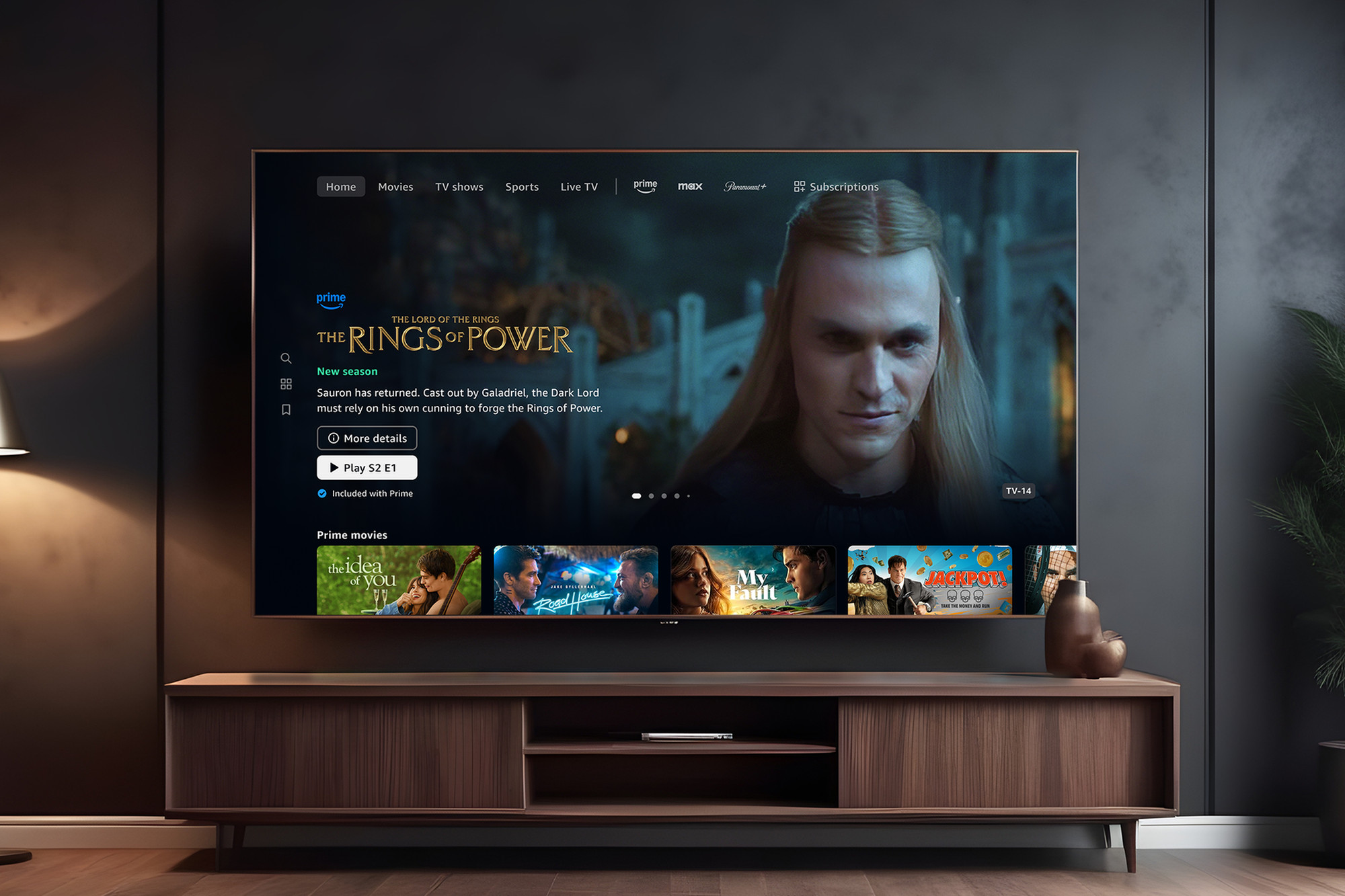
Amazon, at least, looks like they may be trying to do something about it. They are redesigning and relaunching their User Interface (UI). Badged as a redesign to make it more user-centric and personalized, they are also going to include handy icons to tell you when disappointment is about to strike.
There will be a logo to tell you when it is included in Prime, when another subscription is required, or when it is VOD content and you need to pay.
It will also make use of generative AI to tailor recommendations. All of this is fine, as long as it never learns to speak to my browsing history.
The global rollout has already begun, so if you find yourself looking at something new and different in the coming days and weeks then do not panic.
The post Amazon UI To Clear Confusion appeared first on Last Movie Outpost.


